Tag Archives: Tahano Hikamu

Stylistic experiment: Tahano Hikamu and blackletter

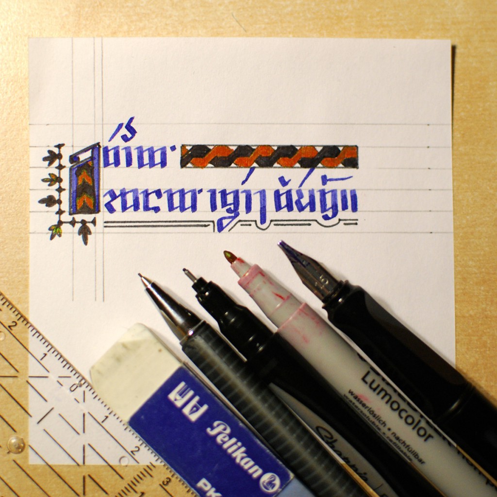
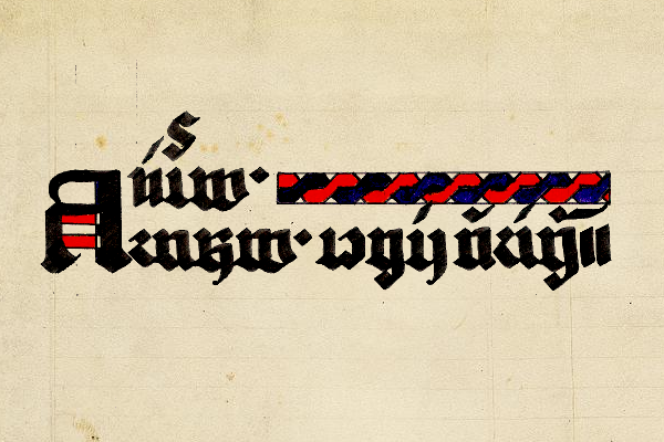
I’m a doodler. More specifically, I’m in the habit of doodling random words and sentences when watching TV. Moreover, ever since I started toying with adapting Ayeri’s Tahano Hikamu writing system to a style that resembles blackletter, that idea hasn’t let go of me, and it’s become part of my idle doodling. I briefly mentioned the idea of a blackletter-style Tahano Hikamu in the grammar (p. 61–62) along with a small example, but I’ve never really documented it seriously.

So, blackletter. What does this have to do with Ayeri, since it undeniably takes some of its aesthetic of sound and spelling not from European languages but rather from southeast Asian languages? And what’s more, its ‘native’ writing system does so as well—maybe even turning some of the features of real-world syllabic alphabets typical of that region up to eleven. On the other hand, so-called Gothic scripts (see e.g. Knight 1996: 320–322, or if you read German, Schneider 2014: 28–85; this is not directly related to the Gothic language and its alphabet) are a western-central European variation of the Latin alphabet which came into fashion in the middle ages. They survive in the shape of blackletter print for certain purposes up to the present day.

Roman and blackletter styles
Roman (italic) and blackletter styles (Source Serif 4 Italic; UniFraktur Maguntia)

Here in Germany at least (and no doubt in other parts of the Germanic-speaking world as well), you can still find blackletter typefaces for instance in the mastheads of newspapers, on pub signs, beer labels, and other things that are supposed to evoke either a long-standing tradition or rustic folklore. Unfortunately, blackletter also has a dark side: it is also associated with the Nazi era and continues to be used in connection to fascist, nationalist, and racist ideas. In my exploration of and toying with this style, I expressly distance myself from such ideologies.

One key characteristic of Gothic scripts—of which blackletter typefaces are a variant—is that they emphasize vertical lines, making characters tall and narrow, like the windows in Gothic cathedrals. Another one is that the round parts of letters are broken up into multiple strokes, with the ‘feet’ of stems typically bent to the right (Schneider 2014: 29). According to Schneider (2014: 28–29) ‘gothification’ of the Carolingian minuscule can be observed first in the Anglo-Norman area, i.e. England and northern France, and also in Belgium in the late 11th and early 12th century. She writes that the style then made its way into central Europe from the mid-12th century on, spreading from west to east. Gothic book hands and blackletter typefaces with their intricate joining together of angles, straight and curved lines, and sometimes even added embellishing hairlines and tittles may lead to very intricate, at times playful shapes in spite of a stout overall look.

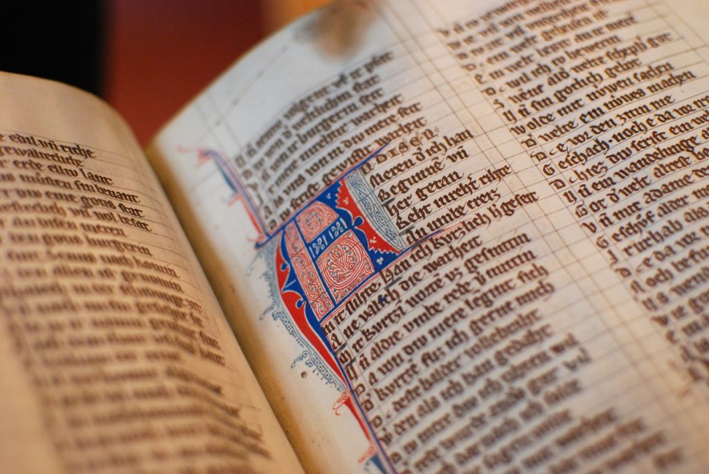
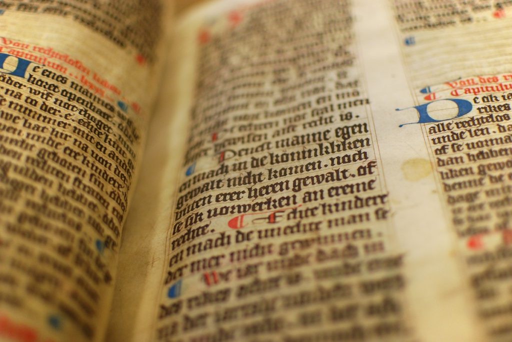
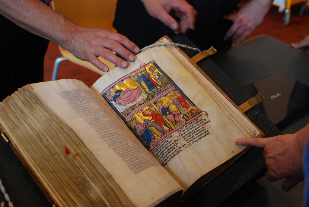
What brought me to combine two such disparate things as Gothic scripts and Ayeri’s writing system, anyway? For one, I’ve been working for the Handschriftencensus research project for the past few years. Handschriftencensus is a meta-catalog on the transmission of all medieval texts in German language by way of manuscripts. In real-life small talk, I like to say it’s basically the Yellow Pages of German codicology research. At the office, we don’t work with old codices directly, however, one of the pre-pandemic perks my job included was participating in excursions to and workshops at libraries such as the Heidelberg University Library’s historical collection and to get literally hands-on with old books there. When not traveling, digitized manuscripts have to suffice. Looking at writing from several hundred years ago is thus part of my current job, and I can’t deny that manuscripts hold some fascination for me, as the photos in this article probably suggest.

A view of the manuscript, St. Gallen, Kantonsbibliothek, Vadianische Sammlung, VadSlg Ms. 302, part 2, fol. 25r, with people's hands around
Getting hands-on with St. Gallen, Cantonal Lib., Vadian Coll., VadSlg Ms. 302 (e-codices, HSC). Displayed here is pt. 2, fol. 25r. Not all medieval manuscripts are this lavishly decorated. Most are drab and practical, made to be used, not treasures to be marveled at.

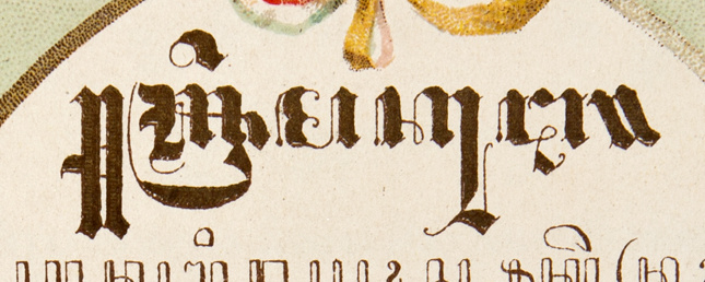
Secondly, I’ve long found southeast Asian scripts such as Balinese, Burmese, Javanese, Khmer, Thai, etc. intriguing both regarding their system of writing and their look, which also had an influence on Tahano Hikamu. Several years ago, I stumbled upon an image on Wikipedia of the title plate of an 1898 book commemorating queen Wilhelmina of the Netherlands’ accession to the throne in 1890. The issue of European colonialism (again, with its history of violence, exploitation, and lingering socioeconomic problems) aside, what especially caught my intrigue here is the first line, which combines Javanese writing with the European blackletter style.

Javanese text written in blackletter style on the title page of a book
Text in Javanese script on the title page of a book printed in Semarang, Indonesia, in 1898 (Koninklijk Huisarchief via Wikimedia Commons, Public Domain)

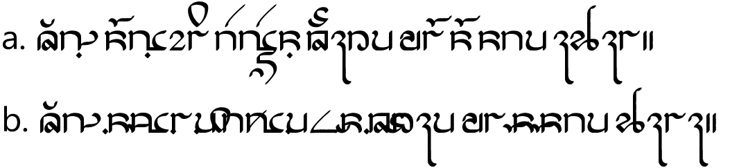
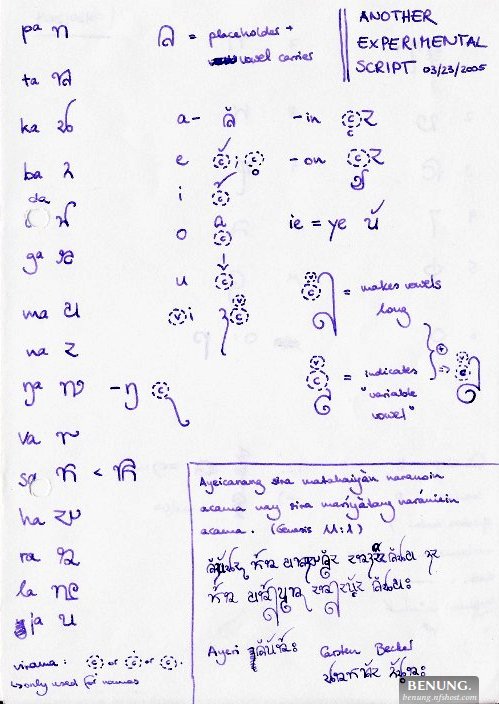
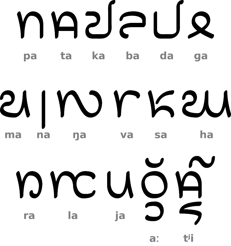
Both the Latin alphabet and the Javanese script emphasize the vertical axis, which opens up a possibility for stylistic experimentation with Gothic style features in an alien environment. If something like this is possible, shouldn’t it also be possible in my script? Tahano Hikamu’s consonant letters as well are mainly built on a lattice of vertical strokes, so there shouldn’t be a problem either to adapt them to broken lines and curly feet. In some cases, it proved even possible to adapt the shape of Latin letters to the ‘gothicized’ Ayeri script directly. The following chart gives an overview of the characters and diacritics with the exception of numerals, which I’ve so far neglected to experiment on.

Chart of blackletter-style Tahano Hikamu characters

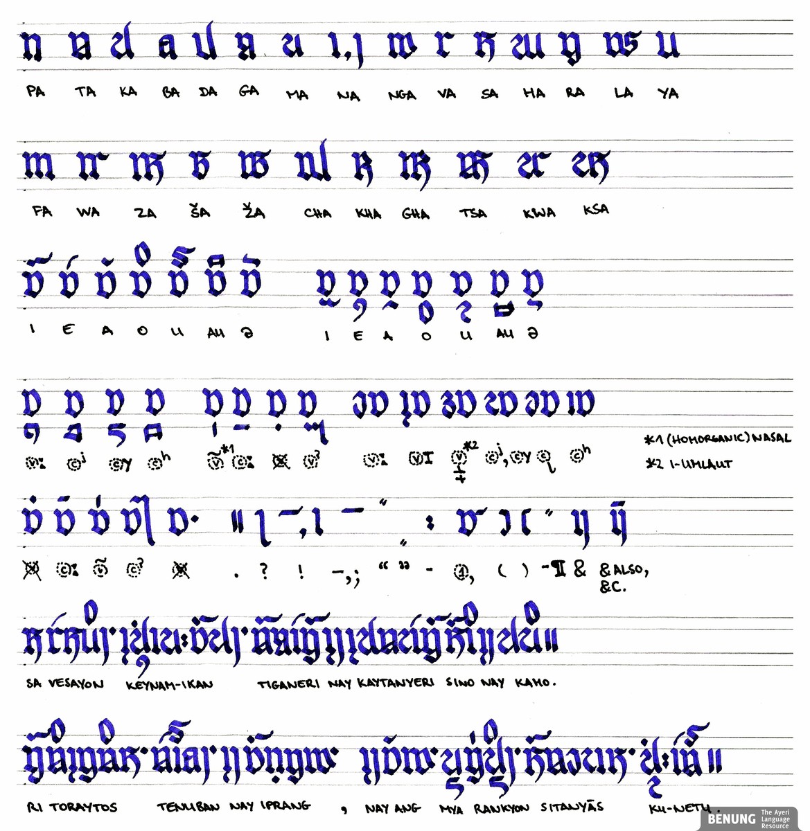
The following correspondences exist, in some cases also independent of the particular style of Tahano Hikamu:

  • TH pa — Lat. n
  • TH ba — Lat. a (double-storey shape)
  • TH na — Lat. i, j
  • TH nga — similar to Lat. w
  • TH va — Lat. r
  • TH ra — similar to Lat. g (looptail shape)
  • TH ya — Lat. u
  • TH fa — Lat. m
  • TH sha — similar to Lat. B
  • TH kha — similar to Lat. R

The diphthong marker appears turned on its head in the above chart (4th line, 5th item from the right), resulting in what looks similar to the quarter rest in music. This is a stylistic variation I have recently experimented with, in part also because I keep forgetting preposed diacritics when doodling words as described initially. Starting with a base stroke thus often rescues the attempt to write a word, so it’s a beneficial feature to keep. The basic grapheme in its ‘canonical’ orientation is straightforward enough to be adapted as well, though. The letter ga posed the greatest challenge, similar to Latin g, which itself has invited stylistic experiments by both scribes and typographers over the centuries as well. For instance, look at the gs in James Todd’s (2015) article on designing the Essonnes typeface, which he samples from a version of the classic Didot. Aren’t they glorious with their serifed lower bowls?

Will you see more of Ayeri written in this style, maybe even a cohesive text? Frankly, I have no idea what the future holds, since I’m still working on my dissertation and am intent on finishing it this year. Small indulgences like writing this blog article already leave me with a slightly bad conscience about neglecting my off-hour duties (working on your PhD is usually an unpaid hobby in German academia, at least in the humanities, and yes, people are not happy about it).

Suffice it to say, doodling in this style has renewed my appreciation for the toil of medieval scribes. It’s a slow and arduous way of writing if you want it to look good, even when it’s just to write a few lines.

  • Knight, Stan. 1996. The Roman Alphabet. In The World’s Writing Systems, edited by Peter T. Daniels and William Bright. New York, NY, and Oxford: Oxford University Press, 312–332.
  • Koninklijk Huisarchief. 2013. Book title commemorating Wilhelmina’s ascension, Semarang 1898. Wikimedia Commons (Public Domain). [Link]
  • Schneider, Karin. 2014. Paläographie und Handschriftenkunde für Germanisten: Eine Einführung. 3rd ed. Sammlung kurzer Grammatiken germanischer Dialekte, B. Ergänzungsreihe 8. Berlin and Boston, MA: de Gruyter. DOI: 10.1515/9783110338676.
  • Todd, James. 2015. Making Fonts: Essonnes. I Love Typography (June 12). [Link]
Private photos of:

Some Blackletter-ish Doodling

I have been looking quite a bit at blackletter writing[1. Things aren’t perfectly angular yet in this period, i.e. the first quarter of the 13th century.] recently and I just randomly doodled around using Ayeri’s script, Tahano Hikamu, as a basis, today:

A blackletter-inspired adaptation of Tahano Hikamu

The letter 〈ba〉 is slightly difficult because it’s looking left whereas most of the other consonant characters are looking right. The difference between the placeholder consonant and 〈ra〉 is also very minimal, but that it is in the regular form (first rows) as well, plus similarity with 〈ta〉. I’m not perfectly happy with that 〈ha〉 either.

You’ve Got Mail

A while ago, David J. Peterson – prolific creator of languages for Hollywood – asked me about maybe providing him with a sample of my fictional language’s script for his new book, The Art of Language Invention. Since I’ve known David from fictional-language venues on the internet for a while and admire his relentless spreading the word that languages are fascinating things to explore (and also to build), I was happy and flattered about his request and sent something. And look what arrived in the mail today! In his book, David found some very kind words on Ayeri (among others):

To date, the best languages ever created were not created for television series or movies, but were created just for the joy of it – languages like […] Carsten Becker’s Ayeri […] — Peterson 15

Goes down like oil, as we say in German … (Heads up conlangers: any idioms in your languages that express feeling flattered?) And on Ayeri’s script, Tahano Hikamu, he writes:

I was aiming to create something that could sit alongside some of the other outstanding conscripts that had been created by conlangers, like Carsten Becker’s Tahano Hikamu […] — Peterson 249

Athdavrazar, David, thanks a ton!

  • Peterson, David J. The Art of Langauge Invention. From Horse-Lords to Dark Elves, the Words Behind World-Building. New York: Penguin Books, 2015. Print.

Tagāti Book G, Graphite and TeXLive 2014

I updated my operating system to Ubuntu 15.04 ‘Vivid’ the other day and ran into trouble when I tried using my Tahano Hikamu font, Tagāti Book G. The issue was that XeLaTeX would ignore Graphite as the text rendering engine for this font in spite of my explicitly declaring it:

\newfontfamily{\Tagati}[
    Renderer=Graphite,
    ...
]{Tagati Book G}

The result was that none of the diacritics were aligned correctly, since the font is not configured for OpenType to handle them:

Demonstration of the bug in fontspec-xetex.sty 2.4a
a: Rendering as expected; b: Graphite ignored

After some research, it turned out that the bug is with the file fontspec-xetex.sty.[1. On my system, the path to the file is /usr/share/texlive/texmf-dist/tex/latex/fontspec/fontspec-xetex.sty, use kpsewhere fontspec-xetex.sty to find it, otherwise.] Ubuntu 15.04 still ships with TeXLive 2014, which includes version 2.4a of it as a part of the fontspec package. In this version, there is a typo in the definition for Graphite which apparently makes it inaccessible through the Renderer option. You can read up on it in the bug report on GitHub.

Changing fontspec-xetex.sty according to the bug report and saving it under my home directory’s TeX tree at ~/texmf/tex/latex/fontspec/ to not overwrite the original file solved the issue for me. Another way to solve the issue for the time being is to include a snippet of code in your TeX file’s preamble that basically redefines the respective function.

The issue is already fixed in the latest version of the fontspec package, also in the version that’s available from CTAN, so I hope there will be an update to the fontspec package in the official Ubuntu repositories as well sometime.

Pangram (revisited)

This is in continuation of an earlier post I wrote on trying to construct a pangram in Ayeri. I just played around with my dictionary a bit again tonight and came up with the following sentence:

4248-pangram
[gloss]Da-bahatang, sa akaya para vaga lamana.
Da=baha-tang, sa aka-ya para vaga-Ø lama-na.
so=shout-3PL.M.A, PT swallow-3SG.M quickly pig-T restaurant-GEN[/gloss]
‘So they shouted that the restaurant’s pig was quickly swallowed.’

This doesn’t make too much sense, but it’s grammatical (vaga ‘pig’ might better trigger neuter agreement on the verb, but whatever – let’s assume this is a boar), uses all consonant characters available in the Ayeri alphabet as well as the virama diacritic (‘gondaya’) only once, and no other diacritics are involved. Also, I didn’t have to make up new words specifically tailored to use up remaining consonants like last time: I admit, I had to make up daga ‘turtle’ in my previous article on pangrams for this purpose.

Happy 10th Anniversary, Ayeri!

Birthday cake (Photo: Will Clayton (spool32)/flickr.com
Happy Birthday! – Bahisley vesang mino! (Photo: Will Clayton (spool32)/flickr.com, CC-BY)

One day in December 2003, in the week just after the 1st Advent,[1. That is the 4th Sunday before Christmas.] the idea for a new conlang was born. An idea that turned out to stick with me for already 10 years now. You guess it: it’s Ayeri’s 10th birthday. Yay!

At that time, my 17 years old self was still fairly new to this whole making-up languages business, read things about linguistics here and there, and wasn’t shy to ask questions about terminology (and, looking at old mails, a little impertinently teenager-like so – sorry!), for example on CONLANG-L and the Zompist Bulletin Board. One thing seemed to catch my interest especially: syntactic alignments other than the NOM/ACC of the few languages I was familiar with, that is, German, English, and French. Apparently this curiosity was big enough for me to grow bored with my second conlang, Daléian (declared “quite complete” after maybe half a year of work or so), and to start something new from scratch in order to put newly acquired knowledge to test. I had read about “trigger languages” on CONLANG-L and wanted to try my hands on making my own. I can’t remember how long it took me to come up with a first draft of an Ayeri grammar, however, I do remember having been told that a good language can’t be made in a summer. Of course, I still didn’t really know what I was doing then, even though I thought I had understood things and authoritatively declared “this is how it works” in my first grammar draft when things sometimes really don’t work that way. But at least an interest had been whetted. Even now, after 10 summers and with more experience, I still come across aspects of my language that can use some work, clarification or correction, as the ‘blog’ page you can find on my website since March 2011 proves over and over again.

Just for fun, slight embarrassment and nostalgia, I went through some old backups contemporary with the very early days of Ayeri. Here is a sentence from the oldest existing document related to it, titled “Draft of & Ideas for my 3rd Conlang” – the file’s last-changed date is December 14, 2003, though I remember having started work on Ayeri in early December. I added glossing for convenience and according to what I could reconstruct from the notes. This uses vocabulary and grammatical markers just made up on the spot and for illustrative purposes; little of it actually managed to make it over into actual work on Ayeri:

[gloss]Ayevhoi agiaemaesim coyaielieðamavir vhaieloyaŋaiye.
Ay-evhoi agia-ema-esim coyai-el-i-eðam-avir vhai-el-o-yaŋa-iye.
3SG.ANI-SUB read-VERB-SUB.A book-NOUN-ANI-INDEF-P bed-NOUN-INAN-on-LOC[/gloss]
‘He reads a book on the bed.’

According to the grammar draft of September 5, 2004, this would have already changed to:

[gloss]Ang layaiyạin mecoyalei ling *pinamea.
Ang laya-iy-a-in me-coya-lei ling *pinam-ea.
A.SUB read-3SG.ANI₁-a₁-SUB INDEF.INAN-book-P.INAN top.of bed-LOC[/gloss]
‘He reads a book on the bed.’

Pinam ‘bed’ was only (re-)introduced on October 24, 2008. In the current state of Ayeri, I would translate the sentence as follows:

[gloss]Ang layaya koyaley ling pinamya.
Ang laya-ya.Ø koya-ley ling pinam-ya.
AT read-3SG.M.T book-P.INAN on.top bed.LOC[/gloss]
‘He reads a book on a/the bed.’

You can see, quite a bit of morphology got lost already early on, especially the overt part-of-speech marking (!) and animacy marking on nouns. Also, prepositions were just incorporated into a noun complex as suffixes apparently. Gender was originally only divided into animate and inanimate, but I changed that sometime because speaking European languages, it felt awkward to me not to be able to explicitly distinguish “he”, “she” and “it”. A feature that also got lost is the assignment of thematic vowels in personal pronouns to 3rd-person referents: originally, every 3rd-person referent newly introduced into discourse would be assigned one of /a e i o u/ to disambiguate, and there was even a morpheme to mark that the speaker wanted to dissolve the association. Constituent order was theoretically variable at first, but I preferred SVO/AVP because of familiarity with that. Later on, however, I settled on VSO/VAP. Also, I had no idea about “trigger morphology” for the longest time – I’m not saying that I know all about it now, just that I have a slightly better understanding … Orthography changed as well over the years, so 〈c〉 in the early examples encodes the /k/ sound, not /tʃ/ as it would today; diphthongs are spelled as 〈Vi〉 instead of modern 〈Vy〉. What was definitely beneficial for the development of Ayeri was the ever increasing amount of linguistics materials available online and my entering university (to study literature) in 2009, where I learnt how to do research and where I have a huge library available. Now I only wish I had the time to read all the interesting things I’ve downloaded and occasionally photocopied over the years.

One of the things people regularly compliment me on is my conlang’s script – note, however, that Tahano Hikamu was not the first one I came up with for Ayeri. Apparently, I had already been fascinated with the look of Javanese/Balinese writing early on; this file is dated February 9, 2004:

First Design for an Ayeri script.
First designs for an Ayeri script.

However, since the letter shapes in this looked so confusingly alike that I could never memorize them, I came up with this about a year later:

First draft of Tahano Hikamu.

What is titled “Another Experimental Script” here is what would later turn into Tahano Hikamu, Ayeri’s ‘native’ script. According to the notes in my conlang ring binder, the script looked much the same as today about a year from then, but things have only been mostly stable since about 2008.

So what’s on for the next 10 years? For one, I’m still kind of embarrassed that I haven’t managed to provide a full-fledged reference grammar in all those years – what you can currently download from my website has been left unfinished for about 3 years now, since working on that grammar always becomes tedious again after newly found enthusiasm typically ebbs after a few weeks. Also, I have long meant to figure out either a proto language for Ayeri, or maybe daughter languages or dialects. However, I don’t really have any schedule or agenda, so I’ll continue to tinker on whichever aspect of Ayeri seems right at the time.

Tahano Hikamu and Handwriting?

My conlang’s ‘native’ writing system as it is presented here is more or less how I imagine it could look like if you adapted the characters for modern printing, so the character shapes are rather elaborate. What I’ve long wondered is how things might look like in day-to-day handwriting. That is, how could some things be simplified if you just want to jot down some notes? After all, you don’t want to sit and take ages to meticulously draw a word – at least in our modern world you wouldn’t want to. Hence – peeking at some documentation of the Ahom script in Hosken/Morey (5, 7) for inspiration – I came up with this chart, which most notably shows simplified versions of the consonant characters ⟨ta⟩, ⟨ba⟩, ⟨ga⟩, ⟨na⟩, ⟨la⟩ as well as some simplifications in the ⟨length⟩ and ⟨i⟩ diacritics:

Besides, since this posting is already on the topic of Tahano Hikamu, I tried mapping the vowels of English to Tahano Hikamu in a halfway consistent manner a while ago, just for fun, and with a winking eye to all the various attempts at reforming English spelling that come up every now and then. There may be some inaccuracies in this list due to the fact that I’m not a native speaker of English. There’s also not much caring about etymology, I just adapted the spellings according to the respective pronunciation I learned.

  • Hosken, Martin and Stephen Morey. “Revised Proposal to add the Ahom Script in the SMP of the UCS.” DKUUG Standardizing. 2012. Dansk Unix User Group, 23 Oct. 2012. Web. 7 Aug. 2013. ‹http://std.dkuug.dk/JTC1/SC2/WG2/docs/n4321.pdf

Tagāti Book G Font is up for Download

Finally! After a couple of weeks of drawing characters (albeit in a rather lazy way) in February and March, and programming font features for the past couple of weeks, I decided to upload my Tahano Hikamu font to Github: https://github.com/carbeck/tagatibookg.

There’s still some things to improve, but for the most part, the font works now. Please be aware that this font uses Graphite and that not so many applications support that. Also, note that in order to use Graphite in Firefox 11+, you will need to activate it first.

The Github repository contains all files used in the making of the font so you can easily clone/download it. But if you really just want the font, you probably want to just

Download the ZIP archive

For some extra fun, here’s basically how I made it: See the video on Youtube

  • I had the ZIP file in my Dropbox ‘Public’ folder, however, Dropbox dropped support for the Public folder a while ago, so the link was broken. I fixed it now.