This article still gets accessed a lot even after over 5 10 years since publishing it. Technology, however, continuously advances, so please be aware that the information below may be outdated.
- Dieser Beitrag ist jetzt auch auf Deutsch zu lesen, nämlich hier.
- By now, I’ve made a font that uses Graphite.
- Keep in mind that I’m not even a semi-professional font designer. All you read here is my subjective experience in learning by doing. I haven’t yet explored font-making beyond what I needed for my own stuff.
One of my ongoing language-construction related pet projects is to bring my constructed language’s writing system to the computer. I have been trying to come up with workable solutions to do this for a number of years, but always hit brick walls sooner or later.
Actually, since you’re reading this, I presume that you have a foot in language creation as well as I do, and since many of us folk seem to like not only fiddling with sounds and meaning, but with computers, too, you may even have created a TTF font for your own language and its ‘native’ script. If it’s an alphabet or a simple syllabary like Japanese Katakana, for example, you will probably not have had that many problems and your greatest worry may be how to type this on a regular computer keyboard. Congratulations!
However, in my case it is unfortunately not quite as simple, since I have an abugida to work with. That is, vowels and other modifiers are indicated by a bunch of accent marks that are placed around consonants, while the vowel that occurs most frequently (usually one of [a ə ɔ], depending on the language) is typically not written out.

If you’re familiar with Semitic languages, it’s similar to that, except all vowels are written out mandatorily. If you’re familiar with writing systems of the Indian subcontinent and South-East Asia, it’s that, basically. And if you’re familiar with Tolkien’s Tengwar writing system (yes, “Elvish”), it’s similar to that, too. Now let’s look at possible solutions I’ve come up with and what problems I’ve run into, which is why I’m frankly very tired of even trying. Yet, the ambitious part of me demands to not simply give up.
1. Precomposing All Combinations
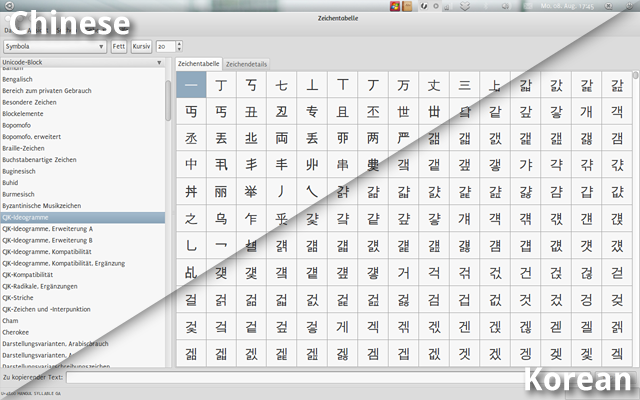
This may be the most simple solution. Just do it the way Chinese characters or Korean syllabograms are encoded in Unicode: Precomposed, coming not only in dozens, but dozens of grosses.

Korean, as you may know, is basically an alphabet, except that syllables are grouped into blocks:

The problem with this is that it’s very tedious to do this for Ayeri’s script, since there are 27 consonant letters, 8 vowel diacritics for the top, 8 vowel diacritics for the bottom, 8 functional diacritics that appear underneath consonants, 7 that appear before them as variants, and 4 that appear above them, partly as variants. Not all combinations are possible, but a rough estimate is that you would arrive at a whopping 69,000,000 approximately 450,000 combinations if my knowledge of combinatorics hasn’t failed me.[1. 27 consonants × 8 top vowels × 8 bottom vowels × 8! 2⁸ functional diacritics = 442,368. The factorial of 8 because all of those can be combined (while changing shape contextually, which is why we can safely ignore the prepended and top diacritics) with each other, but not appear twice per character, so with every step you lose one possible combination.
- Reader Timwi informed me that my calculations were wrong. But it’s still a whole lot of combinations.
] And even if that were wrong, it’d still be an insanely large number anyway if you really wanted to precompose all possible combinations. And then you’d have to write some kind of library that picks the correct character for the syllable you need, preferrably by entering the word in the Latin alphabet for comfort. Big effin’ deal. I haven’t actually tried this because it seemed insane right up front.
2. Backspacing Characters
An idea that I thought to be really clever is to position diacritics around consonants by defining blank characters in the font, the width of which would be negative. That is, all characters in a font have a width, just like any kind of image file. However, these characters – possessing negative width – would not move the cursor forward, but backward as you type them, while still keeping the left-to-right direction of writing intact, thus overlaying the consonant character with the following diacritic. This was actually semi-successful, as indeed some versions of OpenOffice.org 2, as well as some versions of Firefox let themselves be tricked. Tricked, because it’s not actually what you’re supposed to do as it turned out, so most programs I tried this with as well as later versions of OpenOffice.org and Firefox just ignored the minus signs and took the absolute width of spacing characters, resulting in a grossly spaced-out mess. So this wouldn’t be a way to handle things in the long run either.
3. Graphite by SIL
Graphite is a type rendering engine developed by SIL International, who are a Christian missionary society specialising – among others – in providing tools to bring (minority) languages to the computer. You may be offended by the former part, but as a person interested into linguistics probably still support the latter part. The cool thing about Graphite is that it allows you to define your own typesetting features by means of a scripting language called GDL. The commands from your definitions script would be compiled into a given TrueType font file as a last step, so that you receive a custom-tailored font that supports all kinds of dynamic placement and contextual repositioning you wish for. I actually made things halfway work this way once, with a font I didn’t dare to publish because it was too experimental, since I was by no means fluent in GDL, and it wasn’t very esthetic either. It just worked to a reasonable degree. However, as awesome the prospect of being able to describe your own placement rules by means of a scripting language and getting results that actually work may sound, the downside is that – to the best of my knowledge – Graphite is presently only supported by a few programs, most notably OpenOffice.org/LibreOffice, XeTeX, and SIL’s own WorldPad. There also is a pango-graphite library for Linux which extends Graphite functionality to other applications, such as Firefox, but that’s of no use for Windows computers of course. I gave up on trying to extend my script and rid it of bugs sometime because I had better things to do. I might pick up this loose end later again, though. Sadly, however, development of Graphite seems to have stopped, judging from its website, which hasn’t been updated in quite a while.
- It’s been possible for a while now to use Graphite with Firefox even in Windows! Read how to activate it.
4. Anchors in OpenType
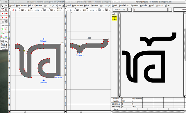
OpenType, a type rendering technology jointly developed by Microsoft and Adobe, is supported by far more programs than Graphite and theoretically comes with a number of features that might actually make a font file for my script work. It’s also what I’ve recently picked up again, after previous playing with OpenType features resulted in frustration (and is about to result in it again). OpenType allows you to not only define contextual variants and reordering, but also to define anchors that diacritics attach to. Essentially like in Graphite, except you don’t write a script, but e.g. FontForge has a WYSIWYG way to place them.

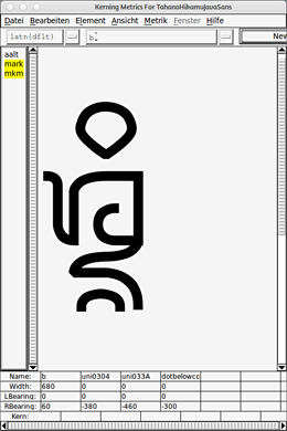
Thanks to ‘mark’ and ‘mkmk’, even assembling more complex characters seems very much feasible:

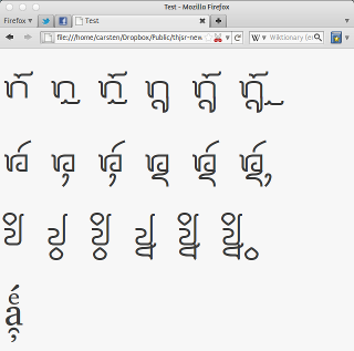
It sounds much like this actually should work in applications that support the simpler, or at least more Latin-script centered functions of the advanced typography features offered by OpenType. However, it turns out that the availability of such features varies quite a lot and is not a given. Thus, what looked like it would work correctly in Fontforge looks like this in Firefox 5 on Ubuntu 10.10 (with the current Firefox 6 Beta on Windows XP SP3 it looks the same, and it has been reported to me to not work at all in Firefox 5 on Windows 7):

As it seems, stacking diacritics is not quite supported the way I conceptualized it, although other fonts that make use of the ‘mkmk’ feature in OpenType – like Charis SIL – get correct placement, as can be seen in the compound character with ‹a› at the bottom line of the screenshot above. And one of Adobe’s flagship programs that supports a good deal of OpenType functions, InDesign (in my case, version CS3), makes it look like this:

Not even here things show up correctly: Although I made sure the ‹ka› character in the third row has all the necessary anchors, bottom-right attaching diacritics just won’t do that for some reason I haven’t yet figured out, while ‹pa› (looks like a Latin ‹n›), for example, does not seem to be a problem.
5. Conclusion
We have seen several approaches towards crafting a TrueType font for Ayeri’s ‘native’ script, Tahano Hikamu. Doing things with SIL’s Graphite or Microsoft/Adobe’s OpenType seemed most feasible, however, there are still barriers that I do not quite know how to tackle – which is frustrating, given that I’ve been trying to come up with solutions for several years already. It’s also the reason that I haven’t yet published such a font for the general public, although it rightly seems from examples I made before that I have two such fonts. However, they lack the functionality I desire, so working with them is rather tedious in that all positioning must be done by manual kerning, for example in InDesign or Photoshop. I hope that sometime I will learn how to achieve my goal of providing a working Tahano Hikamu font, however, not for the time being due to both, limitations in my knowledge of how computers handle TTF files, and restrictions in the implementation of features typesetting systems are theoretically equipped with.
Unfortunately, the method you described in (1) is the only reliable way to do it. I’ve done it with a few fonts, including the font I created for a language I’ve been working on off-and-on the past couple years. There are about 500 extra characters (probably a little more), and they’re formed correctly via ligature (just the way it’s done with Devanagari). Basically, the first keystroke is the stand-alone form of the character. If you follow that with a vowel, it changes it into the previous character plus the vowel character. If you follow it with the same vowel key, it makes the vowel long, etc. It then keeps going until there are no more modifier characters at which point in time it produces the next stand-alone character. It works very well in Mac OS X. Here’s a small sample.
Mostly your article confirmed what I suspected, fonts are still hard. I did see this related blog post about OpenType Ligatures. The demo shows lines moving backwards while typing depending on what went before. This seems like it might be a related thing. Or not. Like I said, fonts to me seem like a hard problem. http://goo.gl/H2VPO
[I’ve taken the liberty to cut down that link you were referring to. —CB]
For what it’s worth, I’ve asked on a typography forum about my issues with anchors. Someone there actually tries to figure it out for me right now, on their own accord, and it seems works to a greater degree than my initial concept:
The discussion is here, if you can read German.
I’m going to make a featural alphabet for my language Kumiko, and there are 400 types of syllables, and for root words, 400 * 400 = 160000 possible combinations, which Unicode can fit them.
Other way, by combining syllables, each syllable can have 2 orientations (up-down vs. left-right) and 10 positions, that is 400 * 2 * 10 = 8000 total glyphs, except I can write a program to generate them.
My best plan is to write a program to generate fonts in SVG, then convert it into other formats.
Plus, it requires hinting to make them legible at low zooms, http://en.wikipedia.org/wiki/Font_hinting
The input method problem is solved for Mac and Linux input methods, just modify an Asian input method, however, there is no customizable input method on Windows.
I had a similar but far less complicated problem with my Cenyani alphabet. In addition to requiring some moving around of the only real diacritic it has (the long sound mark), it’s a bloody vertical script whose columns go from left to right. Naturally, because the issue is not complicated enough yet, the font has well over 500 glyphs, most of which are ligatures.
I got around the first problem – mark positioning – by indeed using the OpenType ‘mark’ feature. Since the horrendously expensive FontLab Studio doesn’t support ‘pos’ rules in OpenType features, I had to use Adobe Font Development Kit for OpenType, which includes the useful MakeOTF utility. Unfortunately, MakeOTF does not seem to compile the ‘mark’ feature as binary tables, which means it only really works in (as far as I can tell) Firefox…
The second problem, that Cenyani is vertical, I got around by writing my own text renderer, which also transcribes the romanised form into text in the Cenyani font.
I guess what I’m trying to say is that it might just be easier to write your own software. But I realise not everyone knows how to do this, and for that reason, I completely agree that this is a big problem. Your proposed solution (1) really is the only solution that is guaranteed to work virtually everywhere…
Thanks for your comment, Adam! As for your own script, you might be interested in CSS Transforms. However, those only seem to be a suggested feature so far, so your mileage might vary with other browsers than Mozilla-based ones.
Although CSS transforms are an interesting and possibly worthwhile idea, there is a problem with them: heurlinius.net/misc/transform.html
The red rectangle is what happens with no adjusting whatsoever: the browser lays out the rest of the page as if no transformation had taken place. The green rectangle is how I’d like it to be. Also note how the rotated text flows from right to left.
Rikchik has a complicated writing system – there are 4 parts of a character, arranged more-or-less in a triangle, each part can vary independently, and I’m still adding options for the center part. My solution was to write my own postscript library which lays out the character (as well as a perl-based image assembly solution for small web images). Details at http://suberic.net/~dmm/rikchik/technical.html . I wouldn’t recommend this process for anyone who doesn’t love programming as much as I do 🙂